Tekmetric Design System
At Tekmetric, the main goal is to service auto shops with the best experience to create repair orders, manage employees, and increase sales.
This project focused on redesigning navigational components to solve these internal and user problems:
Inconsistencies between Figma and Storybook causing implementation issues and prolonged development time.
Misalignment across all product teams introduced new component patterns other teams were not aware of.
Build up of tech debt in the backlog.
RESPONSIBILITIES
Information hierarchy, visual design, stakeholder presentations, cross functional collaboration, user research
ROLE
Lead Product Designer
DURATION
2024 - Ongoing
TEAM
1 director of design, 1 head of engineering, 2 engineers,
1 QA, 1 designer


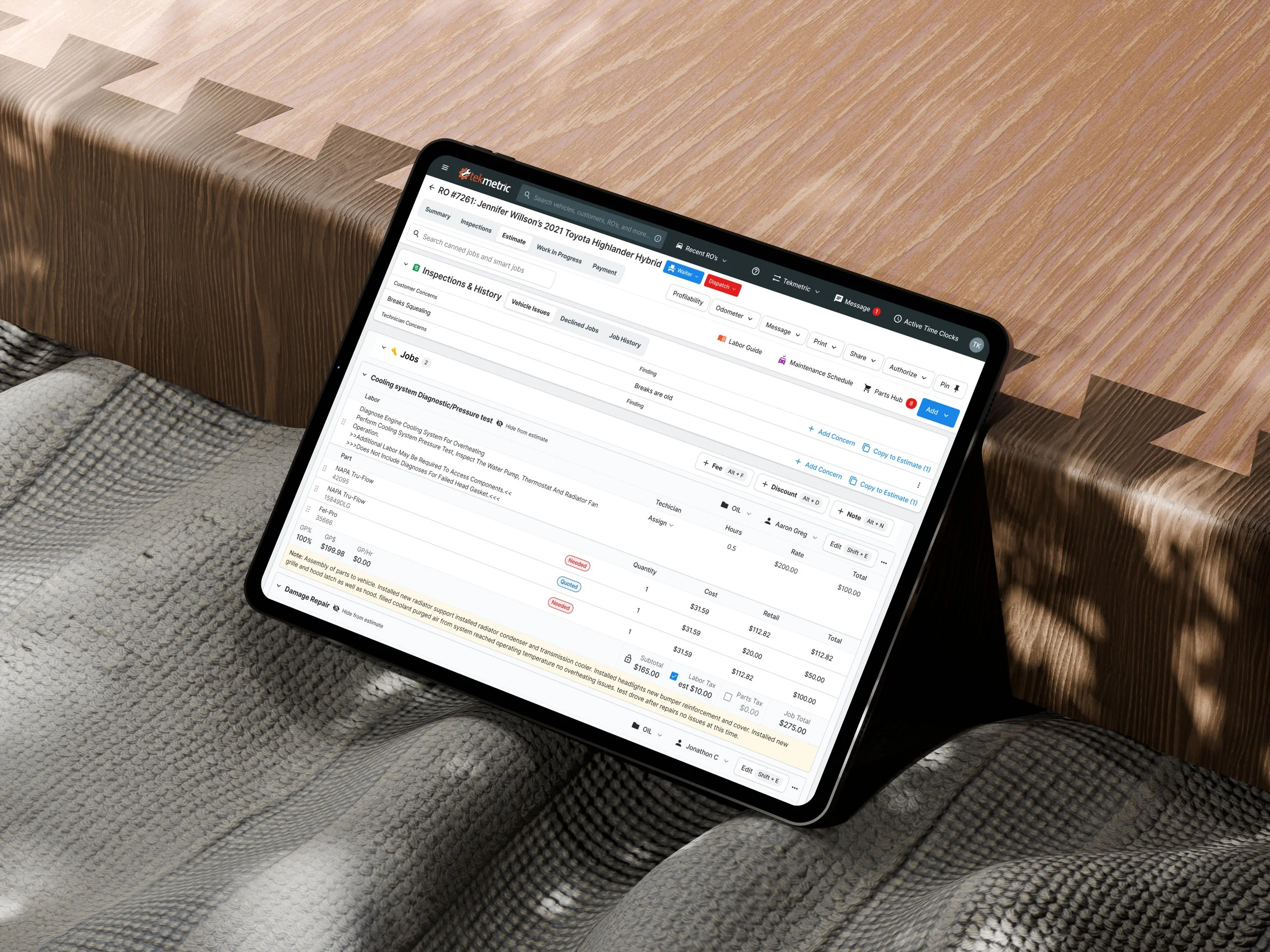
User Problem: Hierarchy and Layout
Lack of clear hierarchy makes it unclear what needs attention first.
Gray-on-gray titles and elements create a sense of weightlessness, making it harder to distinguish elements on the page.
Excessive space between elements creates a feeling of disconnection, rather than cohesion within the RO.
"JOB TOTAL" is the only capitalized item in tables, contributing to hierarchy inconsistency.
The page has limited vertical space due to fixed content, making it hard to scan.
Long ROs (5+ jobs) require excessive scrolling, complicating navigation and locating items.
Design System Problem:
Visual Consistency and Cohesion
Inconsistent button styles: black buttons with icons and text vs. gray icon-only buttons.
Inconsistent language (e.g., "Labor Guide" vs. "Add Part" starts with a verb).
Package pricing icon (blue lock) and maintenance schedule icon (purple) lack color cohesion.
Visual elements, including mixed typography, shadow inconsistencies, and button alignment issues, detract from cohesion.
Different colors are used inconsistently for status indicators and actions (e.g., blue notification bar with red disable button).
Blue-on-blue tabs make inactive tabs look disabled, adding to visual confusion.
Before

After

Measuring Impact / Rollout
LOW IMPACT RELEASE
Small changes with minimal user disruption and low risk.
Examples:
• Minor UI updates (color tweaks, small icon changes).
• Bug fixes that don’t alter workflows.
• Performance optimizations that run in the background.
• Internal changes (code refactoring, logging improvements).
Indicators:
✅ No training or onboarding required.
✅ No impact on core workflows.
✅ No expected downtime or performance issues.
✅ Easily reversible if issues arise.
HIGH IMPACT RELEASE
Major changes that alter core functionality, require user adaptation, and carry higher risk.
Examples:
• Complete UI/UX redesign that changes navigation or workflows.
• A new pricing model or change in payment processing.
• Major backend infrastructure changes that could affect system stability.
• Deprecation or removal of a heavily used feature.
Indicators:
❗ Requires extensive user training, onboarding, or documentation.
❗ Could lead to downtime, performance issues, or major support requests.
❗ High likelihood of user resistance or confusion.
❗ Rollback would be complex and time-consuming.
New Side Bar Menu and Top Nav Bar
As the lead designer, I made 6 rounds of iterations before landing on this solution. As our app was growing with new menu items, I leveraged this redesign to have sub menu items, a modern look, and simpler color palette that didn’t distract from the content.
Designing new components to redesign pages
After implementing these larger changes, it laid the groundwork for redesigning highly used pages like the estimate page.