Founding Designer · 500 Components Modernized
Design System
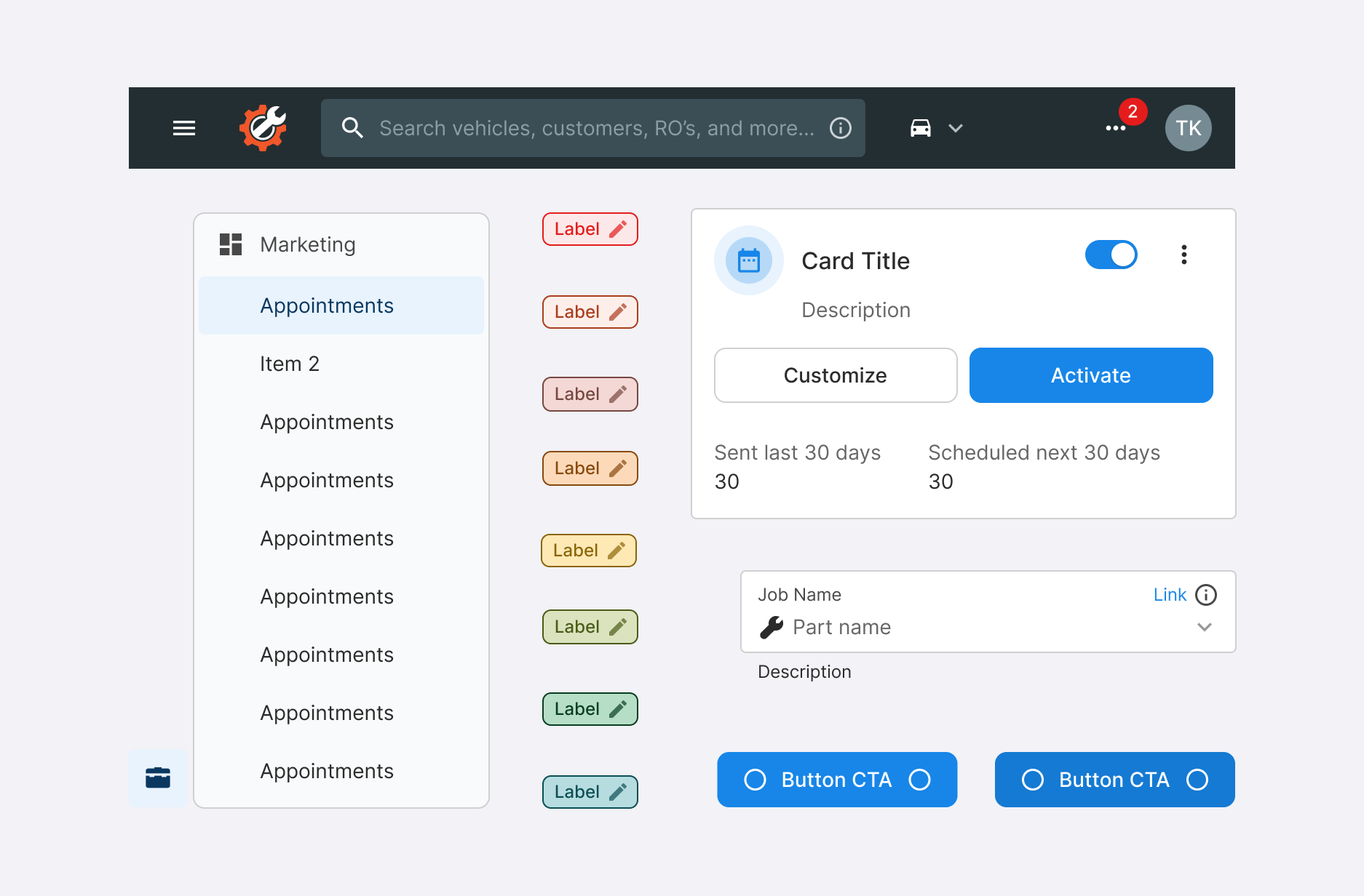
The first company-wide design system at Tekmetric — built solo, without a PM or engineering lead, to align three fragmented component libraries, unlock product velocity, and give teams a scalable, accessible foundation to build on.
Project Goals
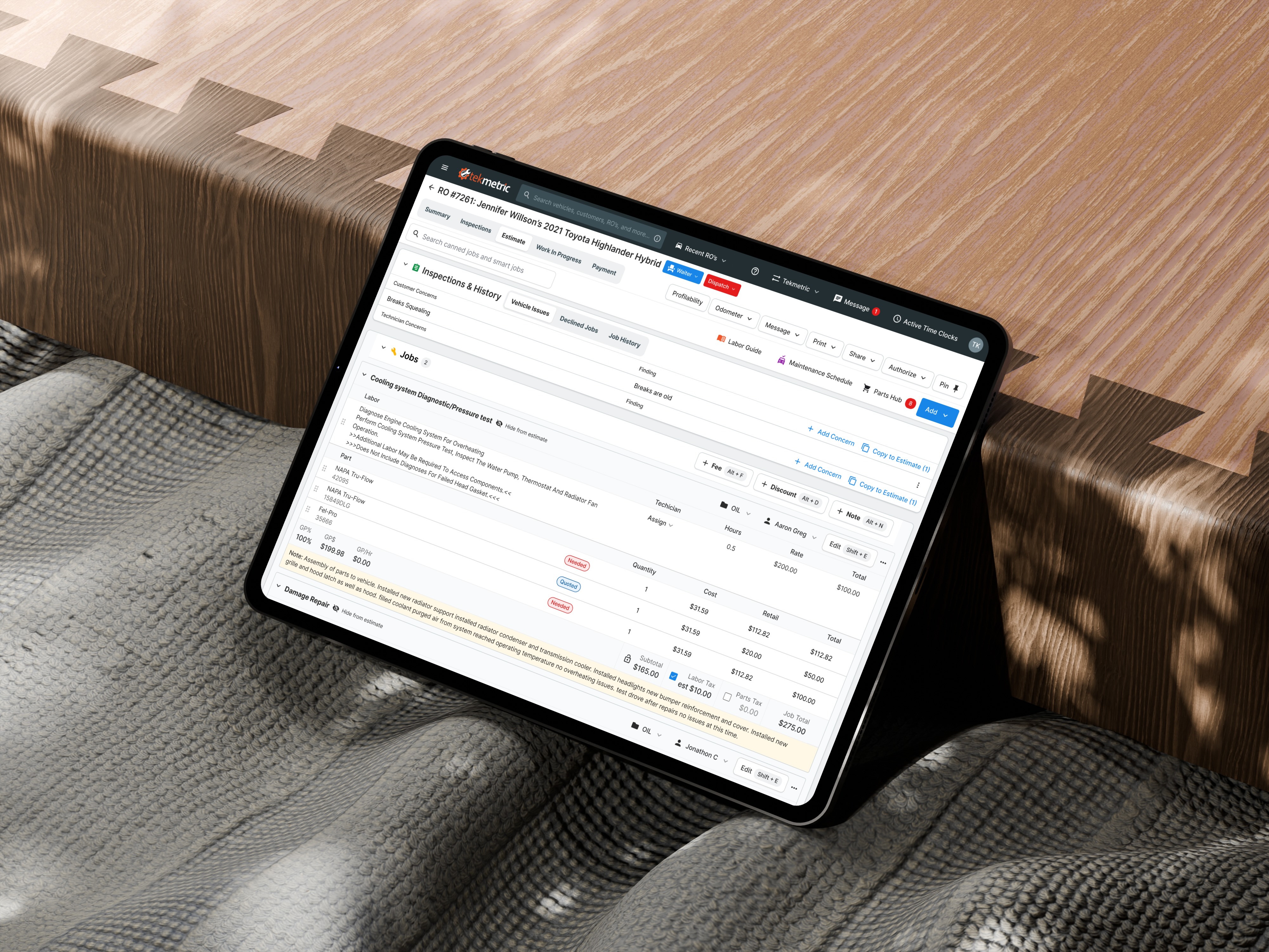
At Tekmetric, the main goal is to service auto shops with the best experience to create repair orders, manage employees, and increase sales.
I joined Tekmetric in 2023 as the company's second designer, working across two product areas, and quickly found engineering building off an outdated, incomplete Storybook library. That gap was creating duplicated components, inconsistent UX, and feature gaps — a real risk to reliability and to the retention this business depends on. As the sole designer, without a PM or engineering lead, I led the company's first design system: spending the first year building a Figma library that mirrored what engineers had already built in Storybook, to bridge alignment between design and engineering, before designing a new system focused on scalability, accessibility, and cohesion. I proposed the initiative to stakeholders as a retention play, backed by a low-risk, incremental rollout plan built from the engineering issues and component duplication I'd gathered — and once it was approved, partnered with a front-end engineer to modernize all 500 components in early 2026.
This project focused specifically on redesigning navigational components to solve:
• Inconsistencies between Figma and Storybook causing implementation issues and prolonged development time.
• Misalignment across all product teams introduced new component patterns other teams were not aware of.
• Build up of tech debt in the backlog.
I joined Tekmetric in 2023 as the company's second designer, working across two product areas, and quickly found engineering building off an outdated, incomplete Storybook library. That gap was creating duplicated components, inconsistent UX, and feature gaps — a real risk to reliability and to the retention this business depends on. As the sole designer, without a PM or engineering lead, I led the company's first design system: spending the first year building a Figma library that mirrored what engineers had already built in Storybook, to bridge alignment between design and engineering, before designing a new system focused on scalability, accessibility, and cohesion. I proposed the initiative to stakeholders as a retention play, backed by a low-risk, incremental rollout plan built from the engineering issues and component duplication I'd gathered — and once it was approved, partnered with a front-end engineer to modernize all 500 components in early 2026.
This project focused specifically on redesigning navigational components to solve:
• Inconsistencies between Figma and Storybook causing implementation issues and prolonged development time.
• Misalignment across all product teams introduced new component patterns other teams were not aware of.
• Build up of tech debt in the backlog.
User Problem
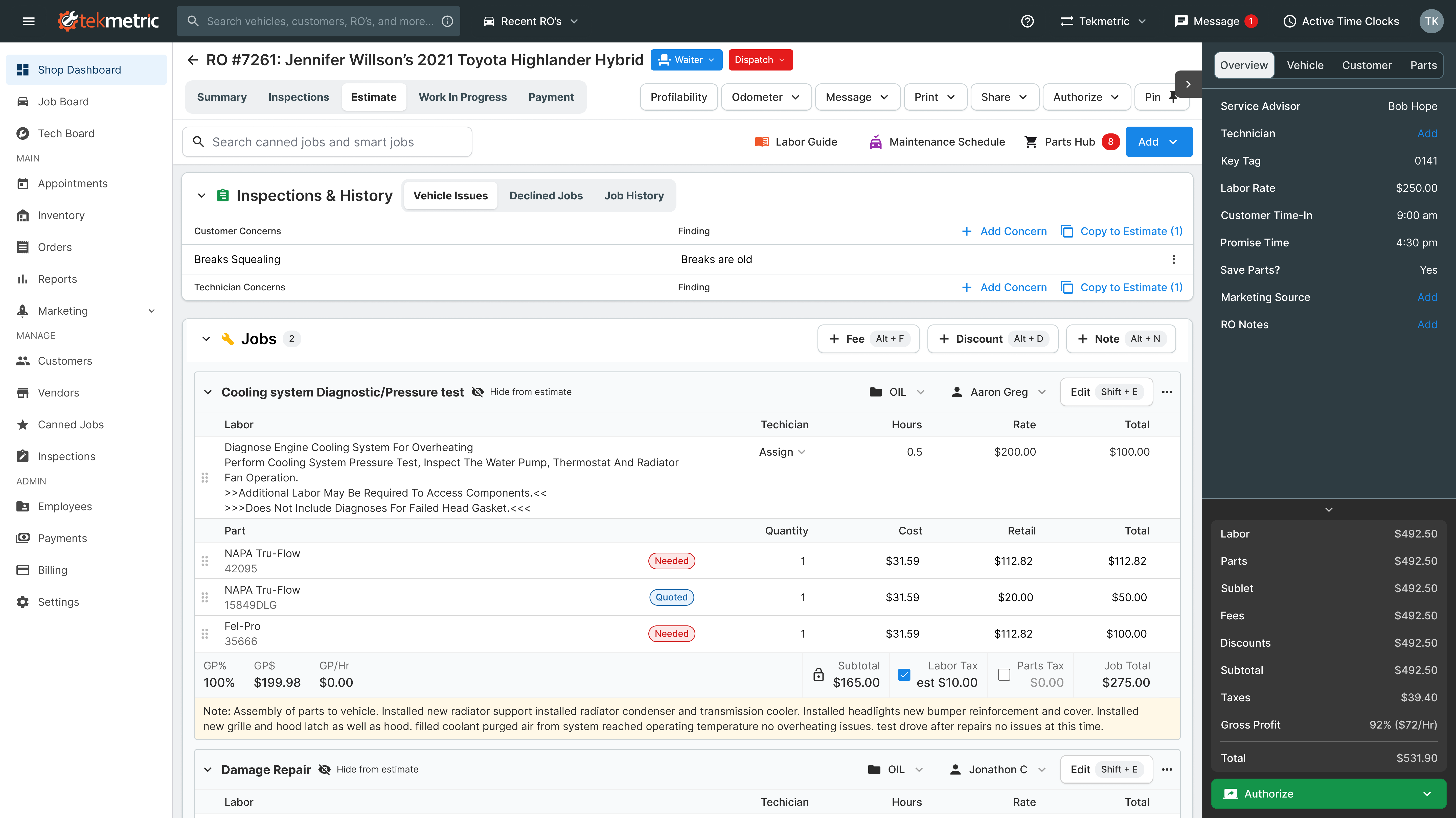
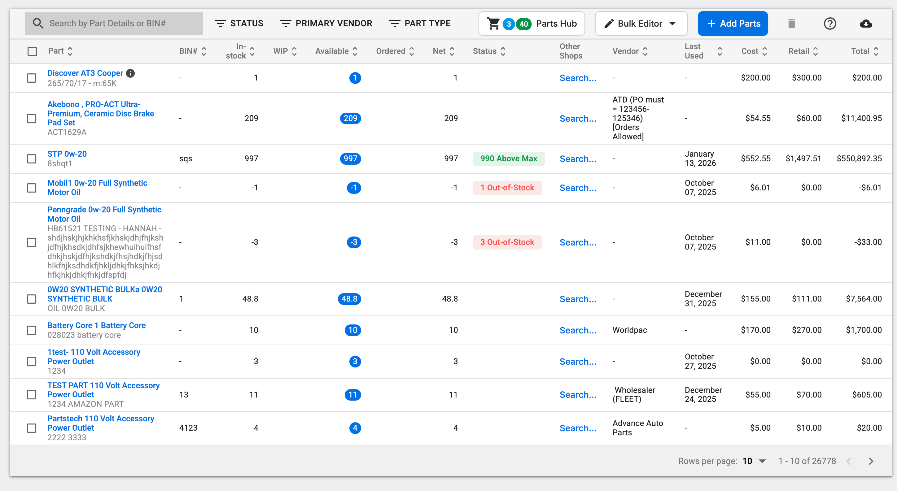
Hierarchy & Layout
• Lack of clear hierarchy makes it unclear what needs attention first.
• Gray-on-gray titles and elements create a sense of weightlessness.
• Excessive space between elements creates a feeling of disconnection.
• The page has limited vertical space due to fixed content, making it hard to scan.
• Long jobs require excessive scrolling, complicating navigation and locating items.
• Gray-on-gray titles and elements create a sense of weightlessness.
• Excessive space between elements creates a feeling of disconnection.
• The page has limited vertical space due to fixed content, making it hard to scan.
• Long jobs require excessive scrolling, complicating navigation and locating items.
Design System Problem
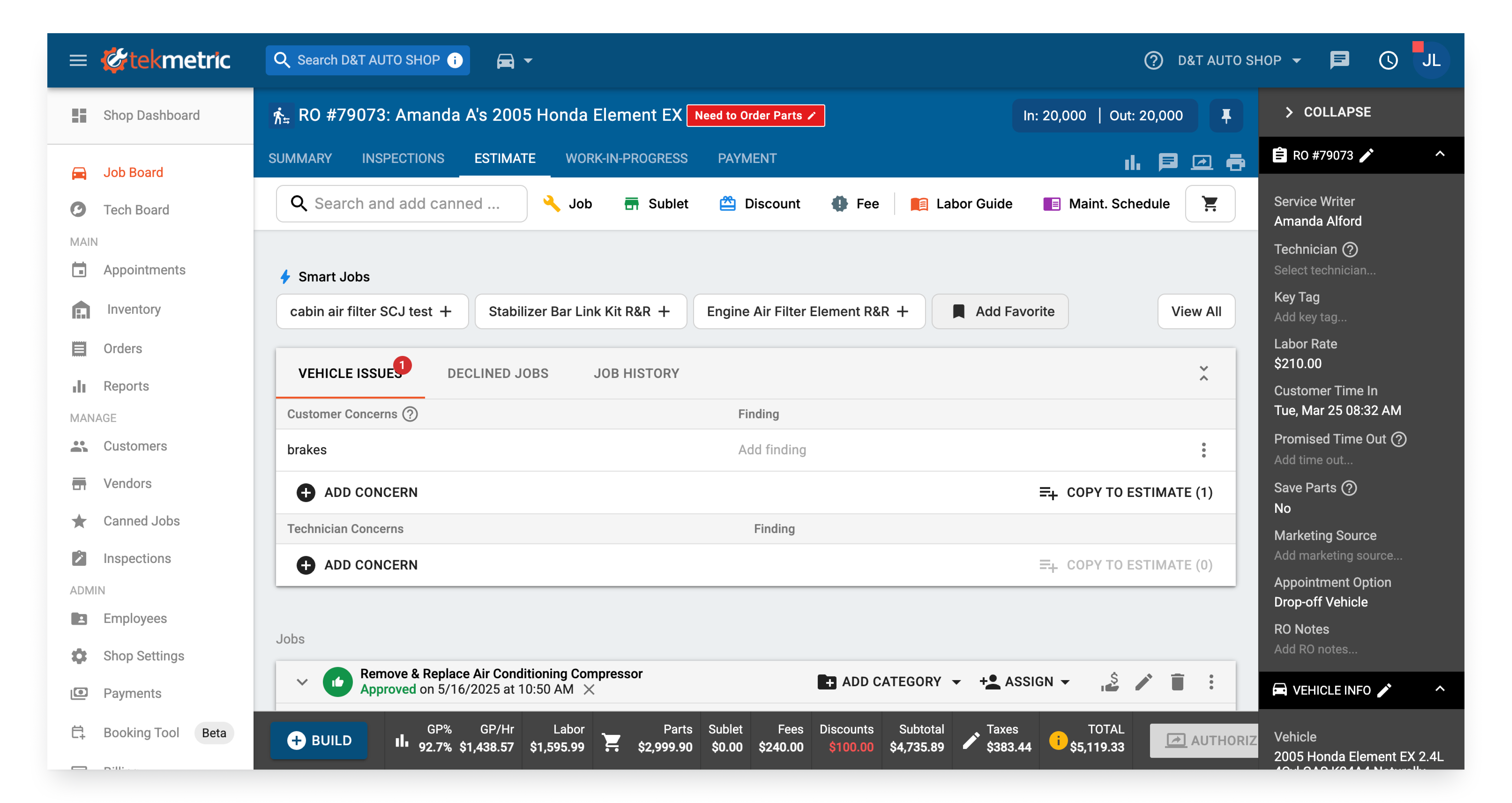
Lack of Consistency and Cohesion
• Inconsistent button styles: black buttons with icons and text vs. gray icon-only buttons.
• Inconsistent language
• Visual elements, including mixed typography, shadow inconsistencies, and button alignment issues, detract from cohesion.
• Different colors are used inconsistently for status indicators and actions.
• Blue-on-blue tabs make inactive tabs look disabled, adding to visual confusion.
• Inconsistent language
• Visual elements, including mixed typography, shadow inconsistencies, and button alignment issues, detract from cohesion.
• Different colors are used inconsistently for status indicators and actions.
• Blue-on-blue tabs make inactive tabs look disabled, adding to visual confusion.
Solution
New Side Bar Menu and Top Nav Bar
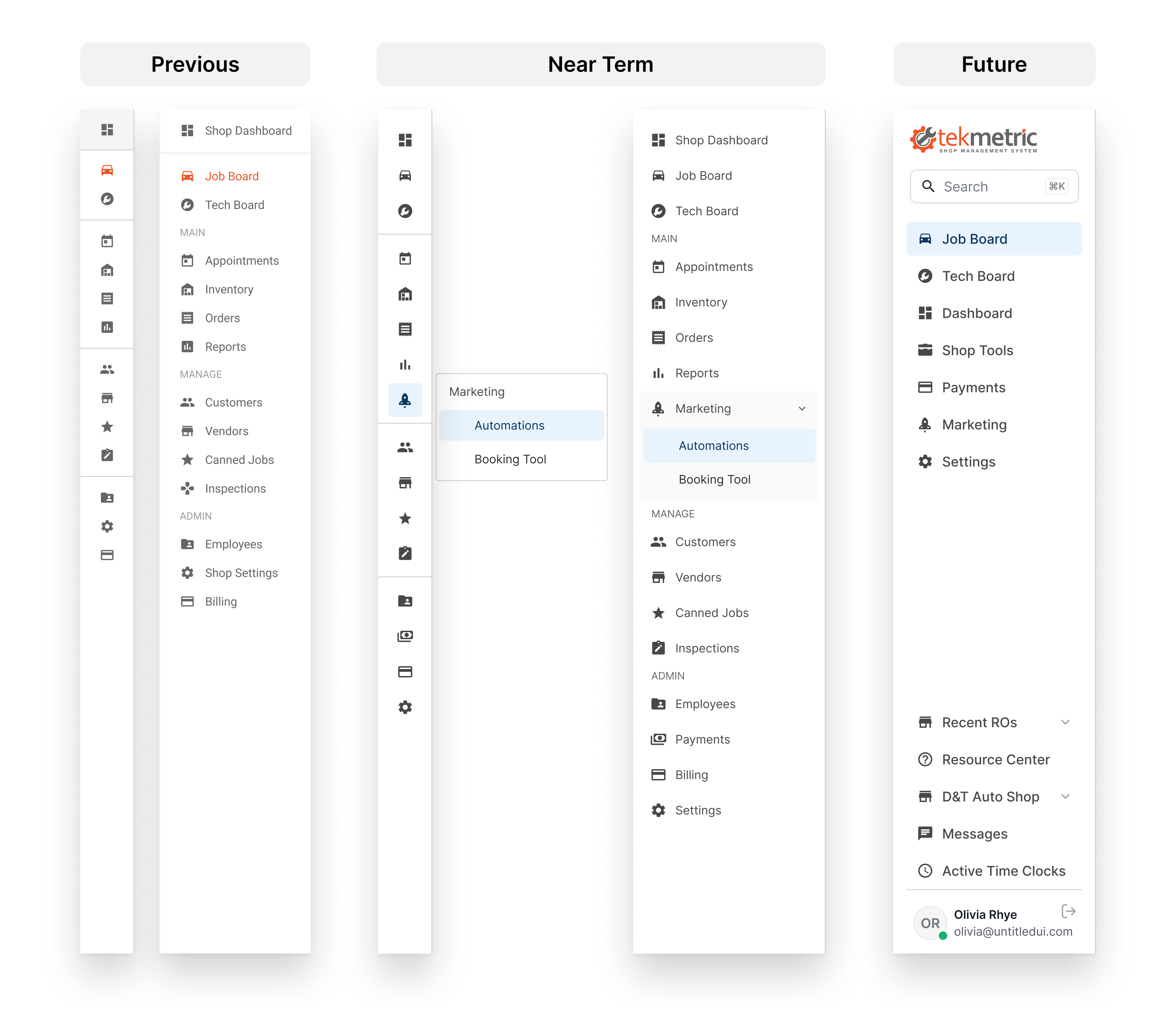
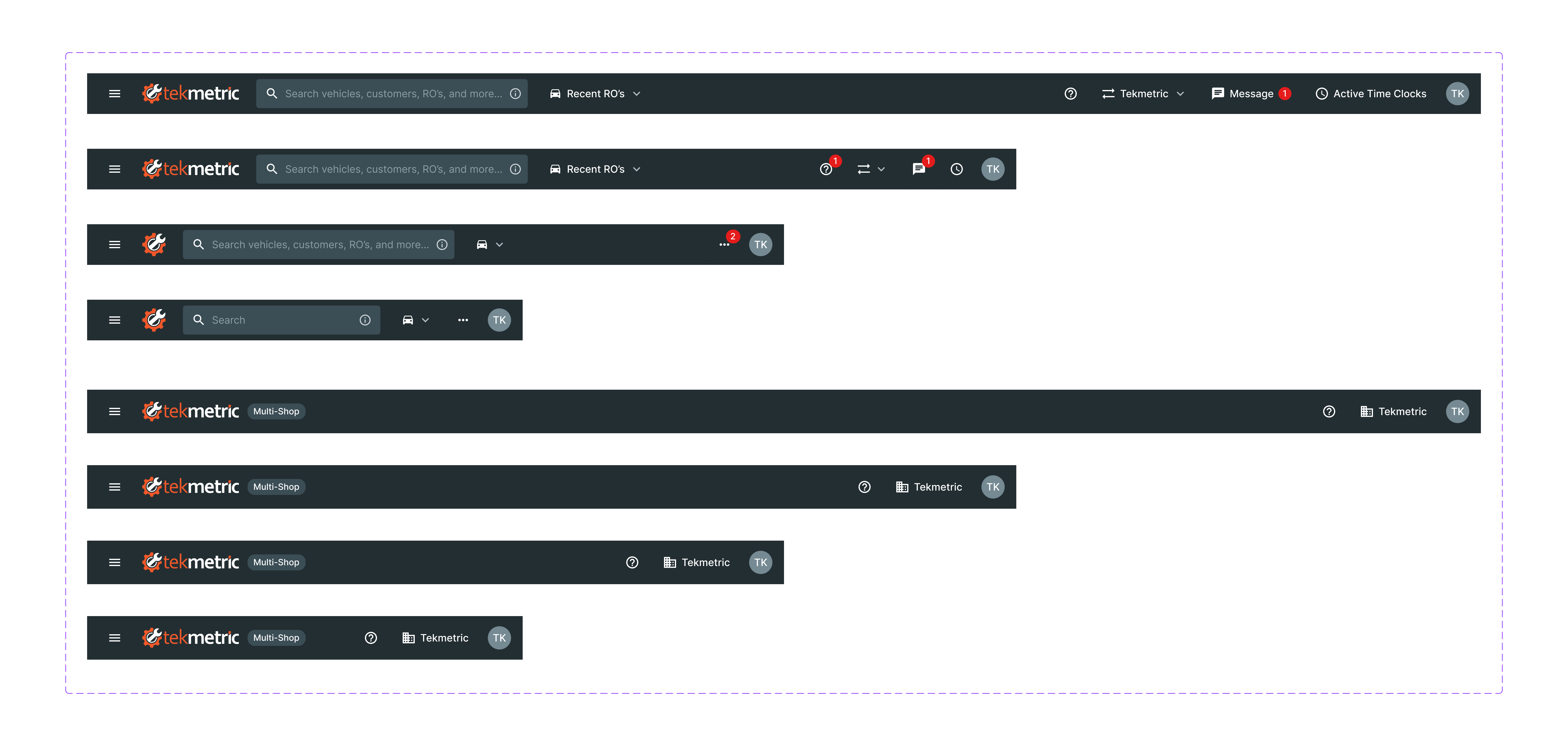
This was the first component I redesigned for the new system, it would set the visual tone for everything that came after. It was highly visible but not especially risky, as long as the order and placement of menu items stayed put, and it was also the most broken component in the product: it didn't scale cleanly across breakpoints or support the nested menu items our growing app needed.
Our users are primarily 40–60 years old, so I did secondary research on how other products in their daily toolkit handled top and side navigation, to keep our experience cohesive with what they already knew. I built a new Figma library with variables mapped to every nav element (buttons, inputs, dropdowns, icons) and explored directions ranging from a future-state side nav that replaced the top nav entirely, to an in-between state that kept the top nav's positioning and item order but added nested menu items and updated colors.
I made 6 rounds of iterations before landing on the version that shipped: nested menu items to handle a growing app, a modern look, and a simpler color palette that didn't distract from the content — while deliberately keeping every existing item in the same place, since that familiarity was what kept users' trust in the product. After launch, I tracked Canny and our Facebook community for usability complaints and found none, saw increased usage on smaller breakpoints, and the nested side nav gave the team room to ship 2 new features that had nowhere to live before.
Our users are primarily 40–60 years old, so I did secondary research on how other products in their daily toolkit handled top and side navigation, to keep our experience cohesive with what they already knew. I built a new Figma library with variables mapped to every nav element (buttons, inputs, dropdowns, icons) and explored directions ranging from a future-state side nav that replaced the top nav entirely, to an in-between state that kept the top nav's positioning and item order but added nested menu items and updated colors.
I made 6 rounds of iterations before landing on the version that shipped: nested menu items to handle a growing app, a modern look, and a simpler color palette that didn't distract from the content — while deliberately keeping every existing item in the same place, since that familiarity was what kept users' trust in the product. After launch, I tracked Canny and our Facebook community for usability complaints and found none, saw increased usage on smaller breakpoints, and the nested side nav gave the team room to ship 2 new features that had nowhere to live before.
Before & After
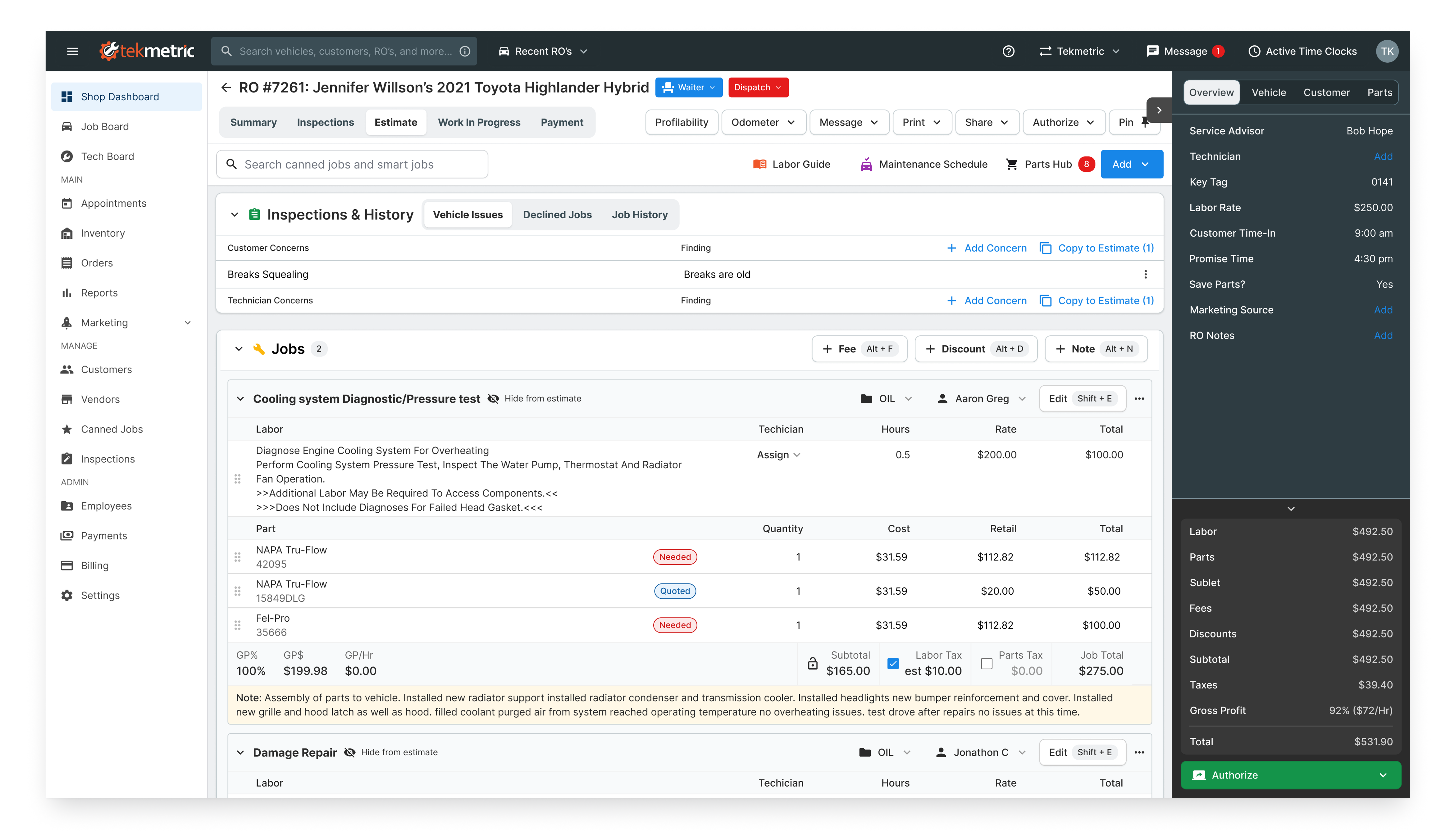
After implementing these larger changes, UI bugs dropped 30% within six months, design-to-engineering handoff time fell from two weeks to three days, and product teams shipped three major features that had previously been blocked and it laid the groundwork for redesigning highly used pages like the estimate page.
Roll Out Plan
Measuring Impact
Low Impact Release
Small changes with minimal user disruption and low risk.
Indicators:
✅ No training or onboarding required.
✅ No impact on core workflows.
✅ No expected downtime or performance issues.
✅ Easily reversible if issues arise.
Small changes with minimal user disruption and low risk.
Indicators:
✅ No training or onboarding required.
✅ No impact on core workflows.
✅ No expected downtime or performance issues.
✅ Easily reversible if issues arise.
High Impact Release
Major changes that alter core functionality, require user adaptation, and carry higher risk.
Indicators:
❗ Requires extensive user training, onboarding, or documentation.
❗ Could lead to downtime, performance issues, or major support requests.
❗ High likelihood of user resistance or confusion.
❗ Rollback would be complex and time-consuming.
Major changes that alter core functionality, require user adaptation, and carry higher risk.
Indicators:
❗ Requires extensive user training, onboarding, or documentation.
❗ Could lead to downtime, performance issues, or major support requests.
❗ High likelihood of user resistance or confusion.
❗ Rollback would be complex and time-consuming.